Introduction to Visualizations
A picture is worth a thousand words…
What is a Visualization?
A visualization is a way to represent data in a visual format. In practice, we use visualizations to explore patterns and communicate results.
Why Visualization Matters
Visualization serves two primary purposes:
- To further your own understanding of your results
- To communicate your results with others
Creating good visualizations is both an art and a science. There is often no single “correct” way to visualize data. However, we must be careful and deliberate when creating visualizations, especially when they will be used in real-world decision-making.
To better understand these principles in action, let’s examine how humans have used visual representations throughout history to understand and communicate complex information. The following examples demonstrate powerful uses of data visualization that have shaped our understanding of the world.
Historical Examples
The World’s First Map (~6200 BC)
What do you see when you look at this ancient artifact?
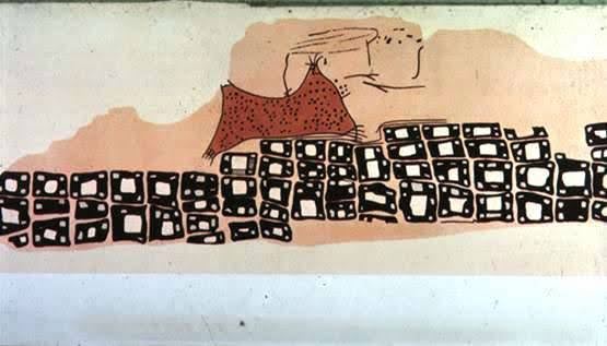
This is a map depicting the town of Konya, Turkey - supposedly the world’s first map, dating back to approximately 6200 BC. Even in prehistoric times, humans recognized the power of visual representation to communicate spatial relationships and important information.
John Snow’s Cholera Map (1854)
Read Ch 2.1, which describes in detail John Snow’s groundbreaking use of data visualization during the 1854 cholera epidemic.
This story demonstrates how observation and visualization can lead to life-saving discoveries, even when the underlying scientific theory (germ theory) wasn’t yet established.
One of the most famous examples of data visualization directly saving human lives.
The Problem: In August 1854, a massive cholera outbreak was devastating the overcrowded SoHo district of London. Hundreds were dying within days, and the prevailing “miasma theory” blamed bad air and smells.
The Solution: Dr. John Snow was skeptical of the miasma theory and suspected contaminated water. He created a revolutionary approach that became standard in epidemiology: he drew a map.
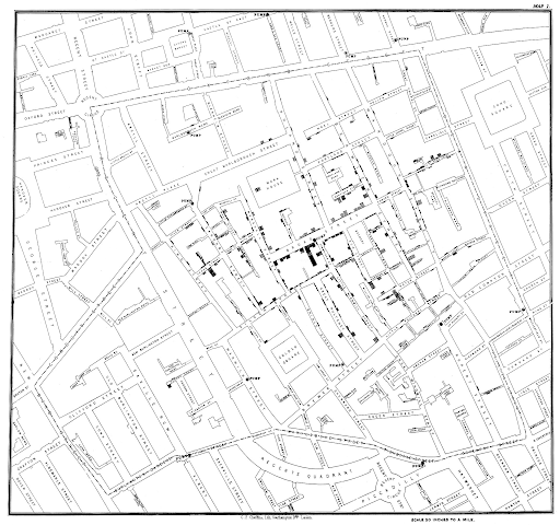
What the map revealed:
- Deaths were clustered around the Broad Street pump
- Houses closer to other pumps still used Broad Street (due to street layout)
- The Lion Brewery had no deaths (workers drank beer and had their own well)
- Scattered distant deaths were children who drank from the pump on their way to school
The Impact: Snow’s map convinced local authorities to remove the handle of the Broad Street pump. Later investigation revealed that a cesspit just feet away had been leaking sewage into the well, contaminating the water with cholera.
Florence Nightingale’s Rose Diagram (1850s)
Florence Nightingale wasn’t just a pioneering nurse, she was also an innovative data visualizer. During the Crimean War, she created what’s now called a “rose diagram” or “coxcomb chart” to visualize the causes of death among British soldiers.
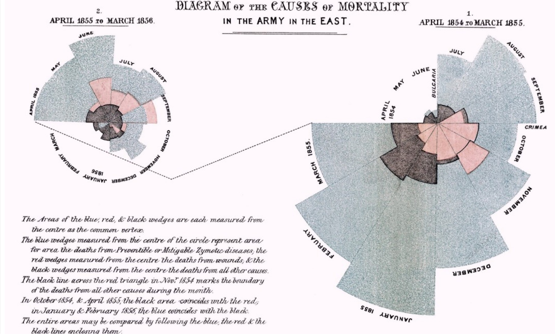
Her visualization revealed a shocking truth: more soldiers were dying from preventable diseases than from battle wounds. This wasn’t just a pretty chart, it was a powerful argument that drove major reforms in military medical care. Nightingale understood that abstract statistics about mortality rates couldn’t compete with the visual impact of her rose petals, where the size of each segment made the disparity impossible to ignore.
Modern Examples
Maya Lin’s Vietnam War Memorial (1982)
Not all data visualization involves charts and graphs. Maya Lin’s Vietnam War Memorial in Washington DC proves that data can be deeply emotional and memorial, not just analytical.

Each of the 58,000+ names etched into the black granite represents one life lost. The chronological arrangement tells the story of the war’s progression through time, while the reflective surface creates an intimate connection between viewers and the data you literally see yourself reflected among the names. This memorial demonstrates that the most powerful visualizations don’t just inform us; they transform how we feel about the information.
COVID-19 Case Tracking (2022)
During the COVID-19 pandemic, data visualization became part of daily life. Suddenly, everyone from epidemiologists to elementary school students was reading line charts showing case trends and interpreting what those curves meant for their communities.
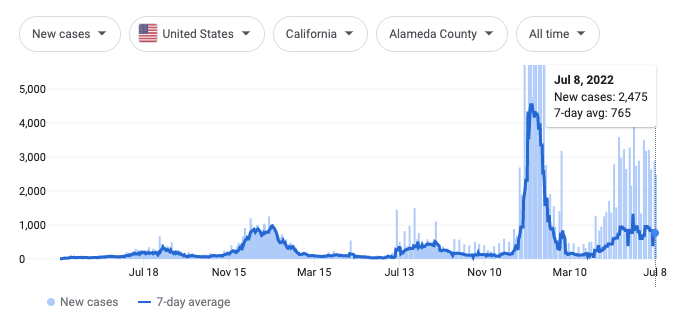
Google’s COVID tracking dashboard exemplified how modern visualization must be both accessible and updateable in real-time. The time series charts showed trends over months with clear visual indicators of peaks and valleys, but more importantly, they translated complex epidemiological data into something any concerned citizen could understand.
Reflection Questions
As you think about these examples, consider:
- What made each visualization effective for its time and purpose?
- How might these visualizations be different if created with modern tools?
- What can we learn from these examples about designing effective visualizations today?
Next Steps
Now that we’ve seen the power of visualization through these historical examples, let’s explore the theory behind what makes visualizations effective.
External Reading
- (mentioned in notes) Computational and Inferential Thinking, Ch 2.1