Encoding
How data variables map to visual elements
The theory behind creating effective visualizations lies in understanding encoding.
What is Encoding?
Encoding is a mapping from a variable to a visual element.
Think of encoding as the bridge between your data and what people see on the screen. It’s how we translate abstract numbers and categories into visual properties that humans can quickly understand.
Basic Example: Bar Charts
In bar charts, length can visually encode a numerical variable.
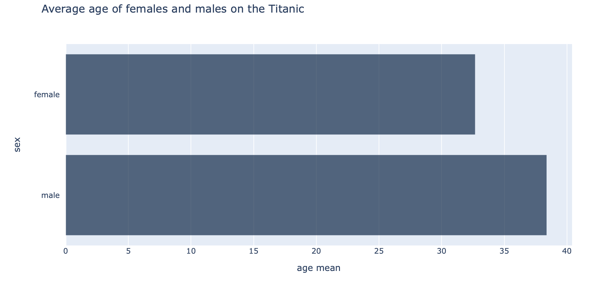
This creates an intuitive mapping where the visual property (bar length) directly corresponds to the data value (average age).
Multiple Variables, Multiple Encodings
Other visualizations can include multiple variables encoded simultaneously.
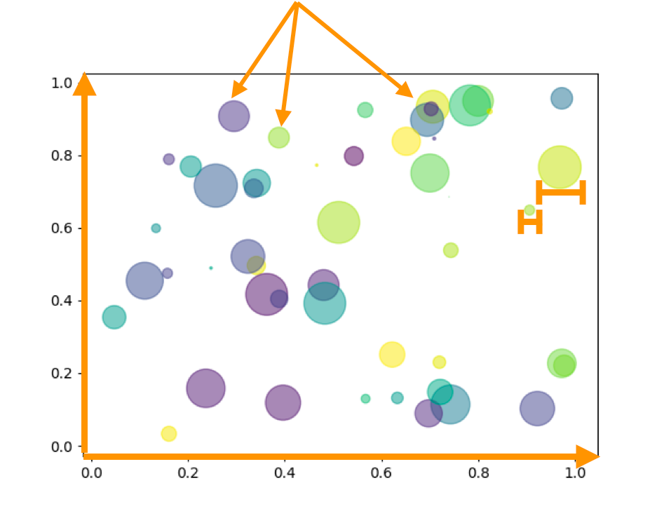
Quick Check: How Many Variables?
Look at the scatter plot above. How many different variables are being encoded? What visual properties are being used?
Four variables are being encoded:
- X-position: Variable 1 (horizontal axis data)
- Y-position: Variable 2 (vertical axis data)
- Size of the dot: Variable 3 (represented by different bubble sizes). Note that this is area. More later…
- Color of the dot: Variable 4 (represented by different colors/hues)
Matching Encodings to Variable Types
As we learned when studying variables, different variable types (numerical vs. categorical, discrete vs. continuous, ordinal vs. nominal) have different properties. When creating visualizations, we need to match our encoding choices to these variable types.
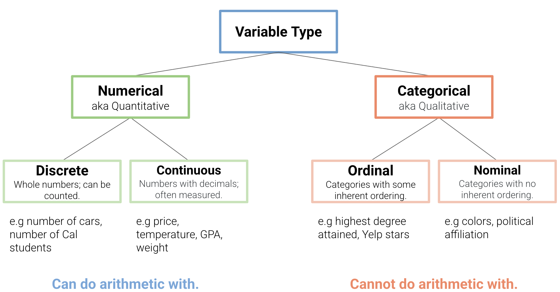
Not all encodings work well with all variable types. The effectiveness depends on how well the visual property matches the data type.
The table below summarizes which visual encodings work best for different types of variables. Understanding these patterns will help you make better choices when designing your visualizations:
| Variable Type | Most Effective Encodings | Less Effective | Why |
|---|---|---|---|
| Numerical | • Position (X, Y) • Length • Area |
• Color hue • Shape |
Humans can judge quantity differences |
| Categorical | • Color hue • Shape • Position (grouping) |
• Length • Area |
Avoids implying false ordering |
Common Encoding Mistakes
What’s Wrong with This?
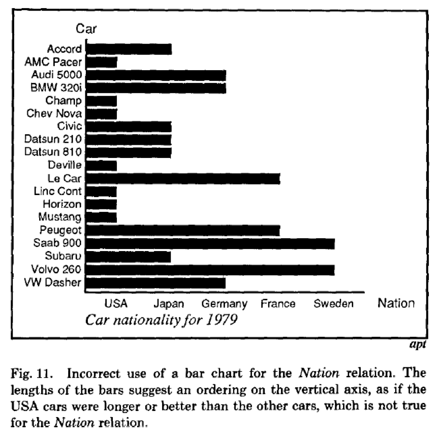
Problem: This graph implies that Swedish cars are “greater” than cars from other countries in some sense, when they’re not. If the variable is just “country of origin” (nominal categorical), using length encoding suggests an ordering that doesn’t exist.
The variable type determines the types of plots (and hence, encodings) that are appropriate.
Summary
Encodings translate variables into visual properties and serve as the fundamental building blocks of data visualization. However, not all encodings work for all variables - effectiveness depends on matching visual properties to data types. The power of encoding lies in how multiple variables can be encoded simultaneously, enabling rich, multidimensional visualizations. Success requires choosing encodings thoughtfully by considering your data types, audience, and message.
Over the next few chapters, we’ll learn how to create several kinds of plots and learn when each encoding approach is most appropriate.