Times Higher Education's website tells us the methodology they use to rank universities:
from datascience import *
import numpy as np
import matplotlib.pyplot as plt
%matplotlib inline
import plotly.express as px

Table.interactive_plots()
Note: We're not going to be able to work through this entire notebook in lecture; you should definitely review whatever we don't get a chance to finish.
Our dataset comes from Times Higher Education (THE)'s World University Rankings 2020. These are slightly outdated as there is a 2021 ranking now, but the data is still relevant.
world = Table.read_table('data/World_University_Rank_2020.csv')
world
| Rank_Char | Score_Rank | University | Country | Number_students | Numb_students_per_Staff | International_Students | Percentage_Female | Percentage_Male | Teaching | Research | Citations | Industry_Income | International_Outlook | Score_Result | Overall_Ranking |
|---|---|---|---|---|---|---|---|---|---|---|---|---|---|---|---|
| 1 | 1 | University of Oxford | United Kingdom | 20,664 | 11.2 | 41% | 46% | 54% | 90.5 | 99.6 | 98.4 | 65.5 | 96.4 | 95.4 | 95.40 |
| 2 | 2 | California Institute of Technology | United States | 2,240 | 6.4 | 30% | 34% | 66% | 92.1 | 97.2 | 97.9 | 88 | 82.5 | 94.5 | 94.50 |
| 3 | 3 | University of Cambridge | United Kingdom | 18,978 | 10.9 | 37% | 47% | 53% | 91.4 | 98.7 | 95.8 | 59.3 | 95 | 94.4 | 94.40 |
| 4 | 4 | Stanford University | United States | 16,135 | 7.3 | 23% | 43% | 57% | 92.8 | 96.4 | 99.9 | 66.2 | 79.5 | 94.3 | 94.30 |
| 5 | 5 | Massachusetts Institute of Technology | United States | 11,247 | 8.6 | 34% | 39% | 61% | 90.5 | 92.4 | 99.5 | 86.9 | 89 | 93.6 | 93.60 |
| 6 | 6 | Princeton University | United States | 7,983 | 8.1 | 25% | 45% | 55% | 90.3 | 96.3 | 98.8 | 58.6 | 81.1 | 93.2 | 93.20 |
| 7 | 7 | Harvard University | United States | 20,823 | 9.2 | 24% | 49% | 51% | 89.2 | 98.6 | 99.1 | 47.3 | 76.3 | 93 | 93.00 |
| 8 | 8 | Yale University | United States | 12,402 | 5.4 | 20% | 50% | 50% | 92 | 94.8 | 97.3 | 52.4 | 68.7 | 91.7 | 91.70 |
| 9 | 9 | University of Chicago | United States | 13,833 | 5.7 | 28% | 46% | 54% | 89.1 | 91.4 | 96.7 | 52.7 | 76 | 90.2 | 90.20 |
| 10 | 10 | Imperial College London | United Kingdom | 16,760 | 11.7 | 56% | 38% | 62% | 84.5 | 87.6 | 97 | 69.9 | 97.1 | 89.8 | 89.80 |
... (1386 rows omitted)
It's always good to check how many schools we're dealing with:
world.num_rows
1396
Some columns ('Number_students', 'International_Students', 'Percentage_Female', 'Percentage_Male') have commas and percentage symbols, meaning they can't be stored as integers. Let's clean them.
# Notice how we use apply here!
def remove_symbol(s):
    return int(s.replace('%', '').replace(',', ''))
# Remember, the result of calling apply is an array
world.apply(remove_symbol, 'Number_students')
array([20664, 2240, 18978, ..., 15236, 17101, 9285])
world = world.with_columns(
    'Number_students', world.apply(remove_symbol, 'Number_students'),
    'International_Students', world.apply(remove_symbol, 'International_Students'),
    'Percentage_Female', world.apply(remove_symbol, 'Percentage_Female'),
    'Percentage_Male', world.apply(remove_symbol, 'Percentage_Male')
)
Now we can sort by any numeric column we want.
world.sort('Percentage_Female')
| Rank_Char | Score_Rank | University | Country | Number_students | Numb_students_per_Staff | International_Students | Percentage_Female | Percentage_Male | Teaching | Research | Citations | Industry_Income | International_Outlook | Score_Result | Overall_Ranking |
|---|---|---|---|---|---|---|---|---|---|---|---|---|---|---|---|
| 16 | 15 | Columbia University | United States | 26586 | 5.8 | 37 | 0 | 0 | 85.6 | 82.6 | 98.2 | 44.8 | 79.3 | 87 | 87.00 |
| 36 | 33 | The University of Tokyo | Japan | 25913 | 10.6 | 12 | 0 | 0 | 85.9 | 89.6 | 60.7 | 77.4 | 38.2 | 75.7 | 75.70 |
| 47 | 40 | The Hong Kong University of Science and Technology | Hong Kong | 10125 | 22.3 | 31 | 0 | 0 | 57.4 | 66.1 | 89.8 | 71.9 | 97.7 | 73.1 | 73.10 |
| 51 | 44 | University of Wisconsin-Madison | United States | 39154 | 10 | 13 | 0 | 0 | 68.8 | 70.3 | 85.3 | 46.3 | 47.4 | 72 | 72.00 |
| 52 | 45 | Washington University in St Louis | United States | 13401 | 7.5 | 20 | 0 | 0 | 64.2 | 57.5 | 98.8 | 40.7 | 57.1 | 71.5 | 71.50 |
| 53 | 46 | Brown University | United States | 9391 | 10.8 | 20 | 0 | 0 | 64 | 56.1 | 94.9 | 36.5 | 61.4 | 70 | 70.00 |
| 57 | 49 | Chinese University of Hong Kong | Hong Kong | 18340 | 18.6 | 32 | 0 | 0 | 55.8 | 62.8 | 84.5 | 55.2 | 97.8 | 69.6 | 69.60 |
| 64 | 54 | Seoul National University | South Korea | 26182 | 12.4 | 12 | 0 | 0 | 72.3 | 71.6 | 66.5 | 86.6 | 35.8 | 68 | 68.00 |
| 74 | 62 | Humboldt University of Berlin | Germany | 33463 | 56.1 | 17 | 0 | 0 | 61.8 | 66.8 | 67.9 | 40.2 | 67.8 | 65 | 65.00 |
| 80 | 67 | University of Science and Technology of China | China | 16245 | 7.7 | 4 | 0 | 0 | 64.6 | 59.5 | 74.7 | 79.6 | 31.3 | 64 | 64.00 |
... (1386 rows omitted)
It seems like the above schools didn't report their sex breakdown, since 0% is the listed percentage of female and male students.
Let's start asking questions.
We have an 'International_Students' column, but that tells us the percentage of international students at each school. Let's update that label to be more clear – let's change the label 'International_Students' to be '% International'.
world = world.relabeled('International_Students', '% International')
world
| Rank_Char | Score_Rank | University | Country | Number_students | Numb_students_per_Staff | % International | Percentage_Female | Percentage_Male | Teaching | Research | Citations | Industry_Income | International_Outlook | Score_Result | Overall_Ranking |
|---|---|---|---|---|---|---|---|---|---|---|---|---|---|---|---|
| 1 | 1 | University of Oxford | United Kingdom | 20664 | 11.2 | 41 | 46 | 54 | 90.5 | 99.6 | 98.4 | 65.5 | 96.4 | 95.4 | 95.40 |
| 2 | 2 | California Institute of Technology | United States | 2240 | 6.4 | 30 | 34 | 66 | 92.1 | 97.2 | 97.9 | 88 | 82.5 | 94.5 | 94.50 |
| 3 | 3 | University of Cambridge | United Kingdom | 18978 | 10.9 | 37 | 47 | 53 | 91.4 | 98.7 | 95.8 | 59.3 | 95 | 94.4 | 94.40 |
| 4 | 4 | Stanford University | United States | 16135 | 7.3 | 23 | 43 | 57 | 92.8 | 96.4 | 99.9 | 66.2 | 79.5 | 94.3 | 94.30 |
| 5 | 5 | Massachusetts Institute of Technology | United States | 11247 | 8.6 | 34 | 39 | 61 | 90.5 | 92.4 | 99.5 | 86.9 | 89 | 93.6 | 93.60 |
| 6 | 6 | Princeton University | United States | 7983 | 8.1 | 25 | 45 | 55 | 90.3 | 96.3 | 98.8 | 58.6 | 81.1 | 93.2 | 93.20 |
| 7 | 7 | Harvard University | United States | 20823 | 9.2 | 24 | 49 | 51 | 89.2 | 98.6 | 99.1 | 47.3 | 76.3 | 93 | 93.00 |
| 8 | 8 | Yale University | United States | 12402 | 5.4 | 20 | 50 | 50 | 92 | 94.8 | 97.3 | 52.4 | 68.7 | 91.7 | 91.70 |
| 9 | 9 | University of Chicago | United States | 13833 | 5.7 | 28 | 46 | 54 | 89.1 | 91.4 | 96.7 | 52.7 | 76 | 90.2 | 90.20 |
| 10 | 10 | Imperial College London | United Kingdom | 16760 | 11.7 | 56 | 38 | 62 | 84.5 | 87.6 | 97 | 69.9 | 97.1 | 89.8 | 89.80 |
... (1386 rows omitted)
Then, to compute the number of international students at each school, we take the number of students at each school, multiply by the percentage of international students at each school, and divide by 100.
world.column('Number_students') * world.column('% International') / 100
array([8472.24, 672. , 7021.86, ..., 457.08, 0. , 185.7 ])
We should probably round the result, since we can't have fractional humans.
num_international = np.round(world.column('Number_students') * world.column('% International') / 100, 0)
num_international
array([8472., 672., 7022., ..., 457., 0., 186.])
We can add this as a column to our table:
world = world.with_columns(
    '# International', num_international
)
And we can sort by this column, while also selecting a subset of all columns just to focus on what's relevant:
world.select('University', 'Country', 'Number_students', '% International', '# International') \
     .sort('# International', descending = True)
| University | Country | Number_students | % International | # International |
|---|---|---|---|---|
| University of Melbourne | Australia | 47385 | 46 | 21797 |
| Monash University | Australia | 52989 | 39 | 20666 |
| Al-Azhar University | Egypt | 342151 | 6 | 20529 |
| UNSW Sydney | Australia | 44336 | 41 | 18178 |
| University of Sydney | Australia | 45111 | 39 | 17593 |
| UCL | United Kingdom | 32665 | 52 | 16986 |
| University of British Columbia | Canada | 52108 | 32 | 16675 |
| Eastern Mediterranean University | Northern Cyprus | 18865 | 83 | 15658 |
| University of Toronto | Canada | 73370 | 21 | 15408 |
| University of Manchester | United Kingdom | 37038 | 40 | 14815 |
... (1386 rows omitted)
This tells us that the University of Melbourne has the most international students, with 21,797. That's larger than many universities!
There are no US universities in the top 10 here. How can we find the universities in the US with the most international students?
Fill in the blanks so that the resulting table contains the 15 universities in the US with the most international students, sorted by number of international students in decreasing order.
# __(a)__ means blank a

world.select('University', 'Country', 'Number_students', '% International', '# International') \
     .where('Country', 'United States') \
     .sort('# International', descending = True) \
     .take(np.arange(15))
| University | Country | Number_students | % International | # International |
|---|---|---|---|---|
| New York University | United States | 44466 | 33 | 14674 |
| University of Illinois at Urbana-Champaign | United States | 44916 | 24 | 10780 |
| Indiana University | United States | 66872 | 15 | 10031 |
| Columbia University | United States | 26586 | 37 | 9837 |
| Arizona State University (Tempe) | United States | 46683 | 21 | 9803 |
| Purdue University West Lafayette | United States | 40451 | 23 | 9304 |
| University of Southern California | United States | 36929 | 25 | 9232 |
| University of Massachusetts | United States | 61204 | 15 | 9181 |
| University of California, Irvine | United States | 32706 | 26 | 8504 |
| University of California, San Diego | United States | 33579 | 23 | 7723 |
... (5 rows omitted)
If you do a quick Google search for "US universities with the most international students", you'll see NYU is usually #1. Cool!
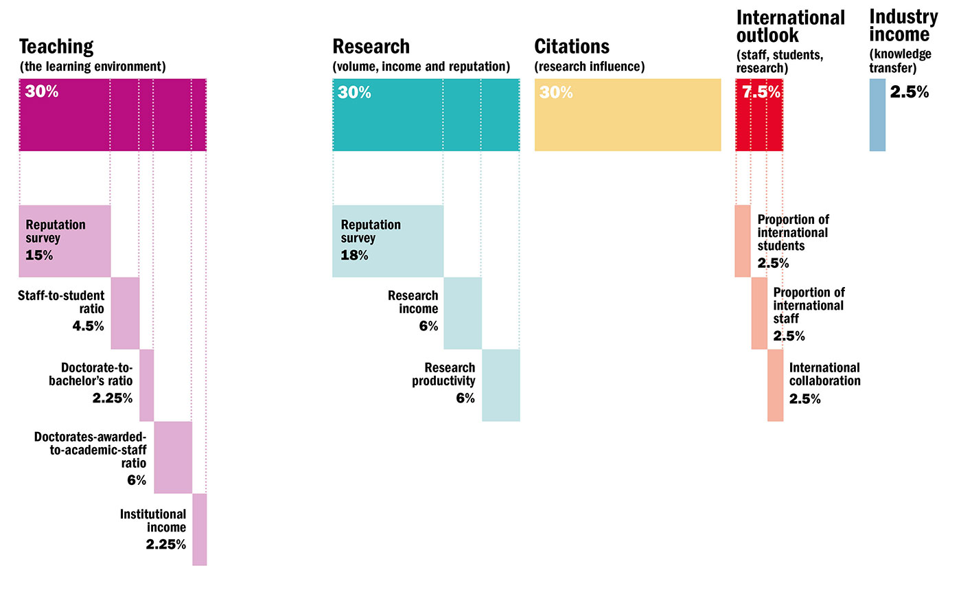
Times Higher Education's website tells us the methodology they use to rank universities:
This means they come up with a 'Teaching', 'Research', 'Citations', 'International_Outlook', and 'Industry_Income' score from 0 to 100 for each school, then compute a weighted average according to the above percentages to compute a school's 'Score_Result', which is how the schools are ranked.
Let's confirm this ourselves. First, let's get a subset of the columns since they won't all be relevant here.
scores_only = world.select('Score_Rank', 'University', 'Teaching', 'Research', 'Citations', 'International_Outlook', 'Industry_Income', 'Score_Result')
scores_only
| Score_Rank | University | Teaching | Research | Citations | International_Outlook | Industry_Income | Score_Result |
|---|---|---|---|---|---|---|---|
| 1 | University of Oxford | 90.5 | 99.6 | 98.4 | 96.4 | 65.5 | 95.4 |
| 2 | California Institute of Technology | 92.1 | 97.2 | 97.9 | 82.5 | 88 | 94.5 |
| 3 | University of Cambridge | 91.4 | 98.7 | 95.8 | 95 | 59.3 | 94.4 |
| 4 | Stanford University | 92.8 | 96.4 | 99.9 | 79.5 | 66.2 | 94.3 |
| 5 | Massachusetts Institute of Technology | 90.5 | 92.4 | 99.5 | 89 | 86.9 | 93.6 |
| 6 | Princeton University | 90.3 | 96.3 | 98.8 | 81.1 | 58.6 | 93.2 |
| 7 | Harvard University | 89.2 | 98.6 | 99.1 | 76.3 | 47.3 | 93 |
| 8 | Yale University | 92 | 94.8 | 97.3 | 68.7 | 52.4 | 91.7 |
| 9 | University of Chicago | 89.1 | 91.4 | 96.7 | 76 | 52.7 | 90.2 |
| 10 | Imperial College London | 84.5 | 87.6 | 97 | 97.1 | 69.9 | 89.8 |
... (1386 rows omitted)
The graphic tells us that the weights for each column are:
'Teaching': 0.3'Research': 0.3'Citations': 0.3'International_Outlook': 0.075'Industry_Income': 0.025(Remember, to convert from percentage to proportion we divide by 100.)
Let's try and apply this to the school at the very top of the table, University of Oxford.
0.3 * 90.5 + \
0.3 * 99.6 + \
0.3 * 98.4 + \
0.075 * 96.4 + \
0.025 * 65.5
95.4175
The result, 95.4175, matches what we see in the 'Score_Result' column for University of Oxford.
We can apply the above formula to all rows in our table as well.
score_result_manual_calculation = \
0.3 * scores_only.column('Teaching') + \
0.3 * scores_only.column('Research') + \
0.3 * scores_only.column('Citations') + \
0.075 * scores_only.column('International_Outlook') + \
0.025 * scores_only.column('Industry_Income')
score_result_manual_calculation
array([95.4175, 94.5475, 94.3775, ..., 11.055 , 10.9625, 10.6875])
To confirm that the results we got match the 'Score_Result' column in scores_only, we can add the above array to our table:
scores_only.with_columns(
    'Score Result Manual', score_result_manual_calculation
)
| Score_Rank | University | Teaching | Research | Citations | International_Outlook | Industry_Income | Score_Result | Score Result Manual |
|---|---|---|---|---|---|---|---|---|
| 1 | University of Oxford | 90.5 | 99.6 | 98.4 | 96.4 | 65.5 | 95.4 | 95.4175 |
| 2 | California Institute of Technology | 92.1 | 97.2 | 97.9 | 82.5 | 88 | 94.5 | 94.5475 |
| 3 | University of Cambridge | 91.4 | 98.7 | 95.8 | 95 | 59.3 | 94.4 | 94.3775 |
| 4 | Stanford University | 92.8 | 96.4 | 99.9 | 79.5 | 66.2 | 94.3 | 94.3475 |
| 5 | Massachusetts Institute of Technology | 90.5 | 92.4 | 99.5 | 89 | 86.9 | 93.6 | 93.5675 |
| 6 | Princeton University | 90.3 | 96.3 | 98.8 | 81.1 | 58.6 | 93.2 | 93.1675 |
| 7 | Harvard University | 89.2 | 98.6 | 99.1 | 76.3 | 47.3 | 93 | 92.975 |
| 8 | Yale University | 92 | 94.8 | 97.3 | 68.7 | 52.4 | 91.7 | 91.6925 |
| 9 | University of Chicago | 89.1 | 91.4 | 96.7 | 76 | 52.7 | 90.2 | 90.1775 |
| 10 | Imperial College London | 84.5 | 87.6 | 97 | 97.1 | 69.9 | 89.8 | 89.76 |
... (1386 rows omitted)
This shows we've successfully reverse-engineered how the rankings work!
Now that we know how to compute 'Score_Result's using THE's percentages, we can also pick our own percentages if we want to prioritize different components in our ranking.
For instance, we may feel like THE's methodology places too much emphasis on research – together, 'Research' and 'Citations' make up 60% of the overall score.
We could choose to use the following breakdown, which we'll call "Breakdown 1":
'Teaching': 60%'International_Outlook': 30%'Industry_Income': 10%breakdown_1 = 0.6 * scores_only.column('Teaching') \
+ 0.3 * scores_only.column('International_Outlook') \
+ 0.1 * scores_only.column('Industry_Income')
breakdown_1
array([89.77, 88.81, 89.27, ..., 18.9 , 17.09, 18.39])
This gives us new overall scores for each school; we can add this column to our table and sort by it.
scores_only = scores_only.with_columns(
    'Breakdown 1', breakdown_1
)
scores_only.sort('Breakdown 1', descending = True)
| Score_Rank | University | Teaching | Research | Citations | International_Outlook | Industry_Income | Score_Result | Breakdown 1 |
|---|---|---|---|---|---|---|---|---|
| 1 | University of Oxford | 90.5 | 99.6 | 98.4 | 96.4 | 65.5 | 95.4 | 89.77 |
| 5 | Massachusetts Institute of Technology | 90.5 | 92.4 | 99.5 | 89 | 86.9 | 93.6 | 89.69 |
| 3 | University of Cambridge | 91.4 | 98.7 | 95.8 | 95 | 59.3 | 94.4 | 89.27 |
| 2 | California Institute of Technology | 92.1 | 97.2 | 97.9 | 82.5 | 88 | 94.5 | 88.81 |
| 10 | Imperial College London | 84.5 | 87.6 | 97 | 97.1 | 69.9 | 89.8 | 86.82 |
| 4 | Stanford University | 92.8 | 96.4 | 99.9 | 79.5 | 66.2 | 94.3 | 86.15 |
| 6 | Princeton University | 90.3 | 96.3 | 98.8 | 81.1 | 58.6 | 93.2 | 84.37 |
| 13 | ETH Zurich | 81.8 | 92.8 | 90.3 | 98.2 | 56.8 | 88.3 | 84.22 |
| 9 | University of Chicago | 89.1 | 91.4 | 96.7 | 76 | 52.7 | 90.2 | 81.53 |
| 7 | Harvard University | 89.2 | 98.6 | 99.1 | 76.3 | 47.3 | 93 | 81.14 |
... (1386 rows omitted)
scores_only.sort('Breakdown 1', descending = True).take(23)
| Score_Rank | University | Teaching | Research | Citations | International_Outlook | Industry_Income | Score_Result | Breakdown 1 |
|---|---|---|---|---|---|---|---|---|
| 13 | University of California, Berkeley | 83 | 90.6 | 99.2 | 70.4 | 46.1 | 88.3 | 75.53 |
Note that when we choose this methodology, UC Berkeley is ranked much lower (24th instead of 13th). This is likely due to:
'Research' and 'Citations' scores not being included in the ranking'Teaching' score'Industry_Income'. This component factors in the amount that the university receives in funding from industrial partners – given that it's a public school it's unsurprising that this amount is low, but also many "wealthy" universities have a relatively low score here too, so it's not clear how much this should matter (see here for more).Maybe we want to place some emphasis on research, but not as much as was placed in the initial ranking. We could then make "Breakdown 2":
'Teaching': 50%'Research': 15%'Citations': 15%'International_Outlook': 15%'Industry_Income': 5%Assign breakdown_2 to an array of overall scores for schools calculated according to our Breakdown 2 above, and add it as a column to scores_only with the label 'Breakdown 2'. _Hint: Start by copying our code for breakdown_1, which was:_
breakdown_1 = 0.6 * scores_only.column('Teaching') \
            + 0.3 * scores_only.column('International_Outlook') \
            + 0.1 * scores_only.column('Industry_Income')
breakdown_2 = 0.5 * scores_only.column('Teaching') \
            + 0.15 * scores_only.column('Research') \
            + 0.15 * scores_only.column('Citations') \
            + 0.15 * scores_only.column('International_Outlook') \
            + 0.05 * scores_only.column('Industry_Income')
scores_only = scores_only.with_columns(
    'Breakdown 2', breakdown_2
)
scores_only.sort('Breakdown 2', descending = True)
| Score_Rank | University | Teaching | Research | Citations | International_Outlook | Industry_Income | Score_Result | Breakdown 1 | Breakdown 2 |
|---|---|---|---|---|---|---|---|---|---|
| 1 | University of Oxford | 90.5 | 99.6 | 98.4 | 96.4 | 65.5 | 95.4 | 89.77 | 92.685 |
| 2 | California Institute of Technology | 92.1 | 97.2 | 97.9 | 82.5 | 88 | 94.5 | 88.81 | 92.09 |
| 3 | University of Cambridge | 91.4 | 98.7 | 95.8 | 95 | 59.3 | 94.4 | 89.27 | 92.09 |
| 5 | Massachusetts Institute of Technology | 90.5 | 92.4 | 99.5 | 89 | 86.9 | 93.6 | 89.69 | 91.73 |
| 4 | Stanford University | 92.8 | 96.4 | 99.9 | 79.5 | 66.2 | 94.3 | 86.15 | 91.08 |
| 6 | Princeton University | 90.3 | 96.3 | 98.8 | 81.1 | 58.6 | 93.2 | 84.37 | 89.51 |
| 7 | Harvard University | 89.2 | 98.6 | 99.1 | 76.3 | 47.3 | 93 | 81.14 | 88.065 |
| 10 | Imperial College London | 84.5 | 87.6 | 97 | 97.1 | 69.9 | 89.8 | 86.82 | 88 |
| 8 | Yale University | 92 | 94.8 | 97.3 | 68.7 | 52.4 | 91.7 | 81.05 | 87.74 |
| 9 | University of Chicago | 89.1 | 91.4 | 96.7 | 76 | 52.7 | 90.2 | 81.53 | 86.8 |
... (1386 rows omitted)
"Breakdown 2" is much closer to THE's actual breakdown and the ordering here reflects that.
What do you care about in a university? Try your own breakdown!
We should note though that we haven't really thought about how THE comes up with the scores for each of the five categories (or the fact that university rankings have inherent flaws).
Back to the full world table:
world
| Rank_Char | Score_Rank | University | Country | Number_students | Numb_students_per_Staff | % International | Percentage_Female | Percentage_Male | Teaching | Research | Citations | Industry_Income | International_Outlook | Score_Result | Overall_Ranking | # International |
|---|---|---|---|---|---|---|---|---|---|---|---|---|---|---|---|---|
| 1 | 1 | University of Oxford | United Kingdom | 20664 | 11.2 | 41 | 46 | 54 | 90.5 | 99.6 | 98.4 | 65.5 | 96.4 | 95.4 | 95.40 | 8472 |
| 2 | 2 | California Institute of Technology | United States | 2240 | 6.4 | 30 | 34 | 66 | 92.1 | 97.2 | 97.9 | 88 | 82.5 | 94.5 | 94.50 | 672 |
| 3 | 3 | University of Cambridge | United Kingdom | 18978 | 10.9 | 37 | 47 | 53 | 91.4 | 98.7 | 95.8 | 59.3 | 95 | 94.4 | 94.40 | 7022 |
| 4 | 4 | Stanford University | United States | 16135 | 7.3 | 23 | 43 | 57 | 92.8 | 96.4 | 99.9 | 66.2 | 79.5 | 94.3 | 94.30 | 3711 |
| 5 | 5 | Massachusetts Institute of Technology | United States | 11247 | 8.6 | 34 | 39 | 61 | 90.5 | 92.4 | 99.5 | 86.9 | 89 | 93.6 | 93.60 | 3824 |
| 6 | 6 | Princeton University | United States | 7983 | 8.1 | 25 | 45 | 55 | 90.3 | 96.3 | 98.8 | 58.6 | 81.1 | 93.2 | 93.20 | 1996 |
| 7 | 7 | Harvard University | United States | 20823 | 9.2 | 24 | 49 | 51 | 89.2 | 98.6 | 99.1 | 47.3 | 76.3 | 93 | 93.00 | 4998 |
| 8 | 8 | Yale University | United States | 12402 | 5.4 | 20 | 50 | 50 | 92 | 94.8 | 97.3 | 52.4 | 68.7 | 91.7 | 91.70 | 2480 |
| 9 | 9 | University of Chicago | United States | 13833 | 5.7 | 28 | 46 | 54 | 89.1 | 91.4 | 96.7 | 52.7 | 76 | 90.2 | 90.20 | 3873 |
| 10 | 10 | Imperial College London | United Kingdom | 16760 | 11.7 | 56 | 38 | 62 | 84.5 | 87.6 | 97 | 69.9 | 97.1 | 89.8 | 89.80 | 9386 |
... (1386 rows omitted)
To determine the number of universities per country, we can group by 'Country':
world.group('Country')
| Country | count |
|---|---|
| Algeria | 8 |
| Argentina | 4 |
| Australia | 35 |
| Austria | 11 |
| Bangladesh | 1 |
| Belarus | 1 |
| Belgium | 8 |
| Brazil | 46 |
| Brunei Darussalam | 1 |
| Bulgaria | 1 |
... (82 rows omitted)
It's a good idea to sort too:
world.group('Country').sort('count', descending = True)
| Country | count |
|---|---|
| United States | 172 |
| Japan | 110 |
| United Kingdom | 100 |
| China | 81 |
| India | 56 |
| Germany | 48 |
| Brazil | 46 |
| Italy | 45 |
| Spain | 45 |
| Iran | 40 |
... (82 rows omitted)
How do we get the number of universities in each country with at least 25 universities on the list?
world.group('Country').where('count', are.above_or_equal_to(25))
| Country | count |
|---|---|
| Australia | 35 |
| Brazil | 46 |
| Canada | 30 |
| China | 81 |
| France | 38 |
| Germany | 48 |
| India | 56 |
| Iran | 40 |
| Italy | 45 |
| Japan | 110 |
... (7 rows omitted)
Run the cell below to see a bar graph of the number of universities in each country above.
world.group('Country').where('count', are.above_or_equal_to(25)).sort('count').barh('Country')
No surprises here!
We could also determine the average 'Score_Rating' for every country in the list.
world.group('Country', np.mean)
| Country | Rank_Char mean | Score_Rank mean | University mean | Number_students mean | Numb_students_per_Staff mean | % International mean | Percentage_Female mean | Percentage_Male mean | Teaching mean | Research mean | Citations mean | Industry_Income mean | International_Outlook mean | Score_Result mean | Overall_Ranking mean | # International mean |
|---|---|---|---|---|---|---|---|---|---|---|---|---|---|---|---|---|
| Algeria | 465.875 | 35610.2 | 21.6125 | 0.75 | 59.75 | 40.25 | 18.325 | 7.5375 | 22.5125 | 34.7 | 36.9125 | 18.1625 | 246.75 | |||
| Argentina | 468.75 | 35442.2 | 12.95 | 2.5 | 63 | 37 | 17.875 | 8.125 | 21.625 | 35.075 | 34.125 | 17.75 | 867 | |||
| Australia | 178.514 | 23652.1 | 29.3314 | 28.3714 | 54.5143 | 42.6286 | 29.6943 | 35.6486 | 75 | 50.1229 | 84.86 | 49.7171 | 6970.23 | |||
| Austria | 225 | 10101.5 | 14.1 | 25 | 49 | 51 | 31.2545 | 23.6273 | 65.3 | 51.3909 | 81.6909 | 43.4727 | 2531.45 | |||
| Bangladesh | 483 | 34108 | 15.6 | 0 | 42 | 58 | 16 | 8.8 | 16.4 | 36.6 | 40.8 | 16.3 | 0 | |||
| Belarus | 459 | 27101 | 8.4 | 9 | 55 | 45 | 21.3 | 9.7 | 13.3 | 42.4 | 58.1 | 18.7 | 2439 | |||
| Belgium | 138.375 | 23646.5 | 33.075 | 19 | 53.125 | 46.875 | 37.4875 | 48.1875 | 71.075 | 72.675 | 72.8125 | 54.3125 | 4399.88 | |||
| Brazil | 447.609 | 27438.1 | 15.4935 | 0.934783 | 48.6087 | 47.0435 | 23.0587 | 13.2543 | 21.2739 | 39.0848 | 23.1239 | 19.987 | 299.043 | |||
| Brunei Darussalam | 234 | 3830 | 10.9 | 15 | 67 | 33 | 23 | 19.3 | 74.4 | 34.8 | 85.8 | 42.3 | 574 | |||
| Bulgaria | 471 | 21988 | 9.3 | 6 | 65 | 35 | 20.7 | 9.6 | 14.2 | 35.3 | 43.7 | 17.5 | 1319 |
... (82 rows omitted)
We need to select the relevant columns here and then sort.
world.group('Country', np.mean).select('Country', 'Score_Result mean').sort('Score_Result mean', descending = True)
| Country | Score_Result mean |
|---|---|
| Singapore | 77.4 |
| Hong Kong | 62.4167 |
| Netherlands | 61.4923 |
| Switzerland | 57.3909 |
| Belgium | 54.3125 |
| Luxembourg | 53.7 |
| Denmark | 51.6286 |
| Germany | 51.3188 |
| Sweden | 51.1167 |
| United States | 50.1081 |
... (82 rows omitted)
This tells us which countries have the "best" universities according to ranking. However, many of the countries at the top are small:
world.where('Country', 'Singapore')
| Rank_Char | Score_Rank | University | Country | Number_students | Numb_students_per_Staff | % International | Percentage_Female | Percentage_Male | Teaching | Research | Citations | Industry_Income | International_Outlook | Score_Result | Overall_Ranking | # International |
|---|---|---|---|---|---|---|---|---|---|---|---|---|---|---|---|---|
| 25 | 24 | National University of Singapore | Singapore | 30869 | 17.9 | 28 | 51 | 49 | 76.8 | 90.4 | 76.9 | 58.8 | 95.5 | 81.9 | 81.90 | 8643 |
| 48 | 42 | Nanyang Technological University, Singapore | Singapore | 25088 | 15.9 | 27 | 48 | 52 | 57.6 | 70.4 | 84.9 | 76.5 | 95.1 | 72.9 | 72.90 | 6774 |
There are only two universities on the list from Singapore, and they're both ranked relatively high.
It turns out this can be answered by grouping with a particular collect function.
def first(arr):
    return arr.item(0)
When we group by 'Country' and use first as our collectfunction, we get the first row for each country in the table. Since the world table is sorted by ranking to begin with, we don't need to sort before grouping.
world.group('Country', first)
| Country | Rank_Char first | Score_Rank first | University first | Number_students first | Numb_students_per_Staff first | % International first | Percentage_Female first | Percentage_Male first | Teaching first | Research first | Citations first | Industry_Income first | International_Outlook first | Score_Result first | Overall_Ranking first | # International first |
|---|---|---|---|---|---|---|---|---|---|---|---|---|---|---|---|---|
| Algeria | 601�800 | 318 | Ferhat Abbas S�tif University 1 | 34002 | 22.7 | 1 | 65 | 35 | 17.7 | 7.7 | 73 | 34.4 | 41.8 | 33.5 | 28.3�35.2 | 340 |
| Argentina | 1001+ | 437 | National University of San Mart�n | 15236 | 15.8 | 5 | 65 | 35 | 16.5 | 8.8 | 31.9 | 35 | 39.1 | 21 | 10.7�22.1 | 762 |
| Australia | 32 | 30 | University of Melbourne | 47385 | 26.3 | 46 | 56 | 44 | 65.9 | 74.1 | 89.8 | 76.3 | 93.1 | 77.8 | 77.80 | 21797 |
| Austria | 134 | 101 | University of Vienna | 33547 | 40.2 | 27 | 66 | 34 | 48.1 | 55.3 | 64.6 | 37.1 | 94.2 | 58.4 | 58.40 | 9058 |
| Bangladesh | 1001+ | 483 | University of Dhaka | 34108 | 15.6 | 0 | 42 | 58 | 16 | 8.8 | 16.4 | 36.6 | 40.8 | 16.3 | 10.7�22.1 | 0 |
| Belarus | 1001+ | 459 | Belarusian State University | 27101 | 8.4 | 9 | 55 | 45 | 21.3 | 9.7 | 13.3 | 42.4 | 58.1 | 18.7 | 10.7�22.1 | 2439 |
| Belgium | 45 | 39 | KU Leuven | 45049 | 36.3 | 15 | 50 | 50 | 58.7 | 73.9 | 85.3 | 99.3 | 71.8 | 73.2 | 73.20 | 6757 |
| Brazil | 251�300 | 172 | University of S�o Paulo | 83214 | 15.9 | 4 | 48 | 52 | 56.4 | 54 | 40.6 | 39.9 | 33.9 | 48.8 | 46.9�50.0 | 3329 |
| Brunei Darussalam | 401�500 | 234 | Universiti Brunei Darussalam | 3830 | 10.9 | 15 | 67 | 33 | 23 | 19.3 | 74.4 | 34.8 | 85.8 | 42.3 | 38.8�42.3 | 574 |
| Bulgaria | 1001+ | 471 | Sofia University | 21988 | 9.3 | 6 | 65 | 35 | 20.7 | 9.6 | 14.2 | 35.3 | 43.7 | 17.5 | 10.7�22.1 | 1319 |
... (82 rows omitted)
Let's sort the resulting table by ranking (and also extract a few relevant columns):
world.group('Country', first) \
.sort('Score_Result first', descending = True) \
.select('Score_Rank first', 'Country', 'University first', 'Score_Result first')
| Score_Rank first | Country | University first | Score_Result first |
|---|---|---|---|
| 1 | United Kingdom | University of Oxford | 95.4 |
| 2 | United States | California Institute of Technology | 94.5 |
| 13 | Switzerland | ETH Zurich | 88.3 |
| 17 | Canada | University of Toronto | 85.5 |
| 22 | China | Tsinghua University | 82.6 |
| 24 | Singapore | National University of Singapore | 81.9 |
| 30 | Australia | University of Melbourne | 77.8 |
| 30 | Germany | LMU Munich | 77.8 |
| 32 | Hong Kong | University of Hong Kong | 75.9 |
| 33 | Japan | The University of Tokyo | 75.7 |
... (82 rows omitted)
By default, the column we grouped by (so 'Country') is the left-most column, but because we selected them in a different order in the last line above they appear in a different order.
What the 'Score_Rank first' column tells us is how highly-ranked the best university in each country is. It tells us the best university in Canada is 17th best in the world, and the best university in Japan is 33rd best in the world – again, according to THE.
Question: What if we wanted the second best, or third best, university in each country?
So far we've been looking at universities across the world. We may want to zoom in on just universities in the US (and also select just a few relevant columns):
us_only = world.where('Country', 'United States') \
               .select('University', 'Number_students', 'Score_Result')
us_only
| University | Number_students | Score_Result |
|---|---|---|
| California Institute of Technology | 2240 | 94.5 |
| Stanford University | 16135 | 94.3 |
| Massachusetts Institute of Technology | 11247 | 93.6 |
| Princeton University | 7983 | 93.2 |
| Harvard University | 20823 | 93 |
| Yale University | 12402 | 91.7 |
| University of Chicago | 13833 | 90.2 |
| University of Pennsylvania | 20578 | 89.6 |
| Johns Hopkins University | 16171 | 89.2 |
| University of California, Berkeley | 41081 | 88.3 |
... (162 rows omitted)
Right now we don't have any information about where these schools are located within the US.
But we can get that information! Let's refer to Wikipedia's article List of research universities in the United States for help. There are two tables there: one for "R1: Doctoral Universities – Very high research activity" and one for "R2: Doctoral Universities – High research activity". For simplicity's sake we'll take just the first table, since the majority of schools in us_only will be contained in it.
Run the cell below to load that table in.
If you're curious as to how we downloaded the information from Wikipedia: We used this site, which allows you to specify a Wikipedia URL and gives you a CSV file.
us_r1 = Table.read_table('data/us-r1-universities.csv')
us_r1
| Institution | Control | City | State |
|---|---|---|---|
| University of Alabama | Public | Tuscaloosa | AL |
| University of Alabama at Birmingham | Public | Birmingham | AL |
| University at Albany | Public | Albany | NY |
| University of Arizona | Public | Tucson | AZ |
| Arizona State University | Public | Tempe | AZ |
| University of Arkansas | Public | Fayetteville | AR |
| Auburn University | Public | Auburn | AL |
| Binghamton University | Public | Vestal | NY |
| Boston College | Private (non-profit) | Chestnut Hill | MA |
| Boston University | Private (non-profit) | Boston | MA |
... (121 rows omitted)
Now, let's join the two tables together. We want to look for matches between the 'University' column in us_only and the 'Institution' column in us_r1.
# Think about why these are the arguments to join!
us_with_state = us_only.join('University', us_r1, 'Institution')
us_with_state
| University | Number_students | Score_Result | Control | City | State |
|---|---|---|---|---|---|
| Auburn University | 26641 | 33.4 | Public | Auburn | AL |
| Boston College | 12904 | 45.9 | Private (non-profit) | Chestnut Hill | MA |
| Boston University | 25662 | 68.4 | Private (non-profit) | Boston | MA |
| Brandeis University | 5375 | 50.3 | Private (non-profit) | Waltham | MA |
| Brown University | 9391 | 70 | Private (non-profit) | Providence | RI |
| California Institute of Technology | 2240 | 94.5 | Private (non-profit) | Pasadena | CA |
| Carnegie Mellon University | 13430 | 81.3 | Private (non-profit) | Pittsburgh | PA |
| Case Western Reserve University | 10654 | 60 | Private (non-profit) | Cleveland | OH |
| Clemson University | 21436 | 30.7 | Public | Clemson | SC |
| Columbia University | 26586 | 87 | Private (non-profit) | New York | NY |
... (86 rows omitted)
The above table only has 96 rows, whereas the bar chart earlier told us there were 172 US schools in our rankings table. That likely means we lost rows as a result of:
us_r1At a glance though it doesn't seem like there are major omissions, since all of the top 10 US schools are still there:
us_with_state.sort('Score_Result', descending = True)
| University | Number_students | Score_Result | Control | City | State |
|---|---|---|---|---|---|
| California Institute of Technology | 2240 | 94.5 | Private (non-profit) | Pasadena | CA |
| Stanford University | 16135 | 94.3 | Private (non-profit) | Stanford | CA |
| Massachusetts Institute of Technology | 11247 | 93.6 | Private (non-profit) | Cambridge | MA |
| Princeton University | 7983 | 93.2 | Private (non-profit) | Princeton | NJ |
| Harvard University | 20823 | 93 | Private (non-profit) | Cambridge | MA |
| Yale University | 12402 | 91.7 | Private (non-profit) | New Haven | CT |
| University of Chicago | 13833 | 90.2 | Private (non-profit) | Chicago | IL |
| University of Pennsylvania | 20578 | 89.6 | Private (non-profit) | Philadelphia | PA |
| Johns Hopkins University | 16171 | 89.2 | Private (non-profit) | Baltimore | MD |
| University of California, Berkeley | 41081 | 88.3 | Public | Berkeley | CA |
... (86 rows omitted)
Let's proceed. Since our original goal was to determine the states in which the best schools were, we can group by 'State' – first with no aggregation function, and then with np.mean to look at the average 'Score_Result' for each state.
us_with_state.group('State').sort('count', descending = True)
| State | count |
|---|---|
| CA | 11 |
| NY | 8 |
| TX | 8 |
| MA | 7 |
| FL | 5 |
| GA | 4 |
| PA | 4 |
| AL | 3 |
| IL | 3 |
| NC | 3 |
... (29 rows omitted)
# sort(1) means sort by the column at index 1, which is 'Score_Result mean'
us_with_state.group('State', np.mean).select('State', 'Score_Result mean').sort(1, descending = True)
| State | Score_Result mean |
|---|---|
| MD | 76 |
| IL | 74.4333 |
| CA | 74.3364 |
| RI | 70 |
| CT | 67.2 |
| NC | 66.7667 |
| MA | 66.4 |
| NJ | 64.75 |
| PA | 64.575 |
| MN | 64.1 |
... (29 rows omitted)
The above tells us that California had the most high-ranked schools in the dataset, while Maryland has the highest average ranking amongst all states in the dataset. However, just like with Singapore earlier, there aren't many schools from Maryland:
us_with_state.where('State', 'MD')
| University | Number_students | Score_Result | Control | City | State |
|---|---|---|---|---|---|
| Johns Hopkins University | 16171 | 89.2 | Private (non-profit) | Baltimore | MD |
| University of Maryland, College Park | 33108 | 62.8 | Public | College Park | MD |
The us_r1 table brought us more information that we haven't yet used – it gave us information about whether each school is public or private! Let's do some initial queries.
us_with_state.group('Control')
| Control | count |
|---|---|
| Private (non-profit) | 36 |
| Public | 60 |
us_with_state.group('Control', np.mean)
| Control | University mean | Number_students mean | Score_Result mean | City mean | State mean |
|---|---|---|---|---|---|
| Private (non-profit) | 15758.9 | 69.7361 | |||
| Public | 30973 | 49.6333 |
It seems like there are fewer US private schools in the dataset, but they're ranked higher than the public schools in the dataset on average. They're also smaller on average, at ~16,000 to ~31,000.
Since we have two categories, we can group:
us_with_state.group(['State', 'Control'])
/opt/conda/lib/python3.8/site-packages/datascience/tables.py:920: VisibleDeprecationWarning:

Creating an ndarray from ragged nested sequences (which is a list-or-tuple of lists-or-tuples-or ndarrays with different lengths or shapes) is deprecated. If you meant to do this, you must specify 'dtype=object' when creating the ndarray
| State | Control | count |
|---|---|---|
| AL | Public | 3 |
| AR | Public | 1 |
| AZ | Public | 1 |
| CA | Private (non-profit) | 3 |
| CA | Public | 8 |
| CO | Public | 1 |
| CT | Private (non-profit) | 1 |
| CT | Public | 1 |
| DC | Private (non-profit) | 2 |
| DE | Public | 1 |
... (41 rows omitted)
But an easier way to look at the above would be to create a pivot table:
us_with_state.pivot('Control', 'State')
| State | Private (non-profit) | Public |
|---|---|---|
| AL | 0 | 3 |
| AR | 0 | 1 |
| AZ | 0 | 1 |
| CA | 3 | 8 |
| CO | 0 | 1 |
| CT | 1 | 1 |
| DC | 2 | 0 |
| DE | 0 | 1 |
| FL | 1 | 4 |
| GA | 1 | 3 |
... (29 rows omitted)
If we want the states with the most public schools in the ranking:
us_with_state.pivot('Control', 'State').sort('Public', descending = True)
| State | Private (non-profit) | Public |
|---|---|---|
| CA | 3 | 8 |
| TX | 1 | 7 |
| FL | 1 | 4 |
| AL | 0 | 3 |
| GA | 1 | 3 |
| IA | 0 | 2 |
| KS | 0 | 2 |
| MI | 0 | 2 |
| NC | 1 | 2 |
| NY | 6 | 2 |
... (29 rows omitted)
What if we want the average 'Score_Result' for each state, separated by public vs. private? We can do that too.
us_with_state.pivot('Control', 'State', 'Score_Result', np.mean)
| State | Private (non-profit) | Public |
|---|---|---|
| AL | 0 | 43.4 |
| AR | 0 | 29.4 |
| AZ | 0 | 61.8 |
| CA | 85.6333 | 70.1 |
| CO | 0 | 59.6 |
| CT | 91.7 | 42.7 |
| DC | 57.8 | 0 |
| DE | 0 | 47.3 |
| FL | 51.2 | 44.325 |
| GA | 64 | 52.9667 |
... (29 rows omitted)
This, in theory, gives us the states with the "best" public universities at the top.
us_with_state.pivot('Control', 'State', 'Score_Result', np.mean).sort('Public', descending = True)
| State | Private (non-profit) | Public |
|---|---|---|
| CA | 85.6333 | 70.1 |
| MN | 0 | 64.1 |
| WA | 0 | 62.9 |
| MD | 89.2 | 62.8 |
| AZ | 0 | 61.8 |
| CO | 0 | 59.6 |
| NC | 84 | 58.15 |
| MI | 0 | 54.15 |
| GA | 64 | 52.9667 |
| UT | 0 | 51.7 |
... (29 rows omitted)
This doesn't mean a whole lot, since the number of public universities in each state is wildly different.
For example, we see Minnesota ('MN') is the second row – there's only one school in the dataset from Minnesota!
us_with_state.where('State', 'MN')
| University | Number_students | Score_Result | Control | City | State |
|---|---|---|---|---|---|
| University of Minnesota | 61120 | 64.1 | Public | Minneapolis | MN |
If you pivot with columns that don't really make sense, you'll get weird results:
us_with_state.pivot('State', 'University')
| University | AL | AR | AZ | CA | CO | CT | DC | DE | FL | GA | IA | IL | IN | KS | KY | LA | MA | MD | MI | MN | MS | MT | NC | NH | NJ | NV | NY | OH | OK | OR | PA | RI | SC | TN | TX | UT | VA | WA | WV |
|---|---|---|---|---|---|---|---|---|---|---|---|---|---|---|---|---|---|---|---|---|---|---|---|---|---|---|---|---|---|---|---|---|---|---|---|---|---|---|---|
| Auburn University | 1 | 0 | 0 | 0 | 0 | 0 | 0 | 0 | 0 | 0 | 0 | 0 | 0 | 0 | 0 | 0 | 0 | 0 | 0 | 0 | 0 | 0 | 0 | 0 | 0 | 0 | 0 | 0 | 0 | 0 | 0 | 0 | 0 | 0 | 0 | 0 | 0 | 0 | 0 |
| Boston College | 0 | 0 | 0 | 0 | 0 | 0 | 0 | 0 | 0 | 0 | 0 | 0 | 0 | 0 | 0 | 0 | 1 | 0 | 0 | 0 | 0 | 0 | 0 | 0 | 0 | 0 | 0 | 0 | 0 | 0 | 0 | 0 | 0 | 0 | 0 | 0 | 0 | 0 | 0 |
| Boston University | 0 | 0 | 0 | 0 | 0 | 0 | 0 | 0 | 0 | 0 | 0 | 0 | 0 | 0 | 0 | 0 | 1 | 0 | 0 | 0 | 0 | 0 | 0 | 0 | 0 | 0 | 0 | 0 | 0 | 0 | 0 | 0 | 0 | 0 | 0 | 0 | 0 | 0 | 0 |
| Brandeis University | 0 | 0 | 0 | 0 | 0 | 0 | 0 | 0 | 0 | 0 | 0 | 0 | 0 | 0 | 0 | 0 | 1 | 0 | 0 | 0 | 0 | 0 | 0 | 0 | 0 | 0 | 0 | 0 | 0 | 0 | 0 | 0 | 0 | 0 | 0 | 0 | 0 | 0 | 0 |
| Brown University | 0 | 0 | 0 | 0 | 0 | 0 | 0 | 0 | 0 | 0 | 0 | 0 | 0 | 0 | 0 | 0 | 0 | 0 | 0 | 0 | 0 | 0 | 0 | 0 | 0 | 0 | 0 | 0 | 0 | 0 | 0 | 1 | 0 | 0 | 0 | 0 | 0 | 0 | 0 |
| California Institute of Technology | 0 | 0 | 0 | 1 | 0 | 0 | 0 | 0 | 0 | 0 | 0 | 0 | 0 | 0 | 0 | 0 | 0 | 0 | 0 | 0 | 0 | 0 | 0 | 0 | 0 | 0 | 0 | 0 | 0 | 0 | 0 | 0 | 0 | 0 | 0 | 0 | 0 | 0 | 0 |
| Carnegie Mellon University | 0 | 0 | 0 | 0 | 0 | 0 | 0 | 0 | 0 | 0 | 0 | 0 | 0 | 0 | 0 | 0 | 0 | 0 | 0 | 0 | 0 | 0 | 0 | 0 | 0 | 0 | 0 | 0 | 0 | 0 | 1 | 0 | 0 | 0 | 0 | 0 | 0 | 0 | 0 |
| Case Western Reserve University | 0 | 0 | 0 | 0 | 0 | 0 | 0 | 0 | 0 | 0 | 0 | 0 | 0 | 0 | 0 | 0 | 0 | 0 | 0 | 0 | 0 | 0 | 0 | 0 | 0 | 0 | 0 | 1 | 0 | 0 | 0 | 0 | 0 | 0 | 0 | 0 | 0 | 0 | 0 |
| Clemson University | 0 | 0 | 0 | 0 | 0 | 0 | 0 | 0 | 0 | 0 | 0 | 0 | 0 | 0 | 0 | 0 | 0 | 0 | 0 | 0 | 0 | 0 | 0 | 0 | 0 | 0 | 0 | 0 | 0 | 0 | 0 | 0 | 1 | 0 | 0 | 0 | 0 | 0 | 0 |
| Columbia University | 0 | 0 | 0 | 0 | 0 | 0 | 0 | 0 | 0 | 0 | 0 | 0 | 0 | 0 | 0 | 0 | 0 | 0 | 0 | 0 | 0 | 0 | 0 | 0 | 0 | 0 | 1 | 0 | 0 | 0 | 0 | 0 | 0 | 0 | 0 | 0 | 0 | 0 | 0 |
... (86 rows omitted)
Make sure to review all of the code in this notebook, as it's all great review for the quiz.